Facebook Business Page Redesign
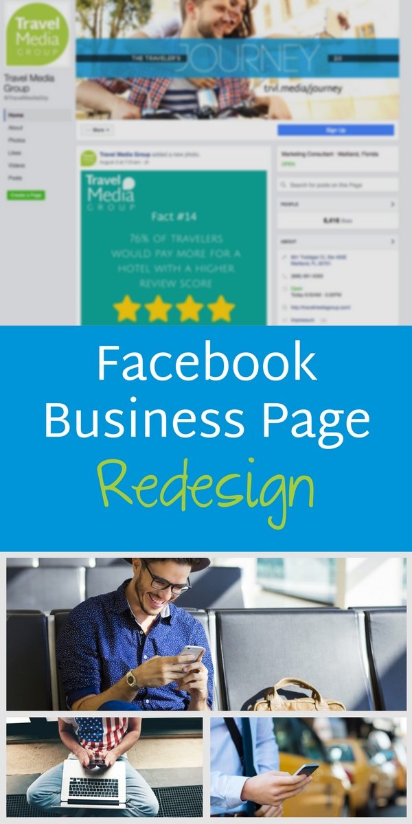
If you logged on to your Facebook business page today, you may have noticed a big difference. Previously, the business page design mirrored individual profile pages – large cover photo across the top with a layered profile photo. Today, you’ll see a much more streamlined version, with none of the overlay text obstructing your cover photo. The tabs that were along the bottom of your photo show to the left of the page – no more choosing which few are most important to you to show. Here’s everything that changed and what you need to know.
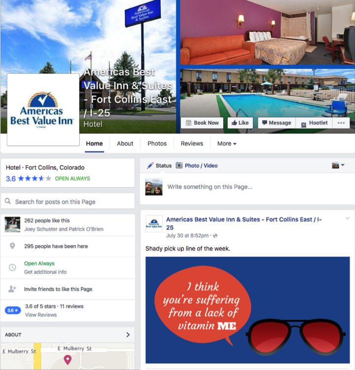
Before
Before the switch, a lot of information was packed over your cover photo, including the page name, business type, and items such as Like, Message, and your action (here, it’s Book Now). Under, you could choose a few tabs of important pages, but the rest were hidden under a More heading.
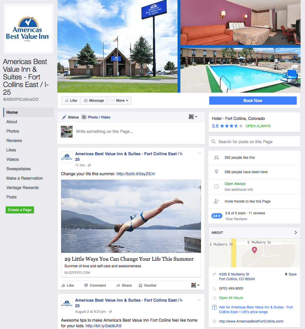
After
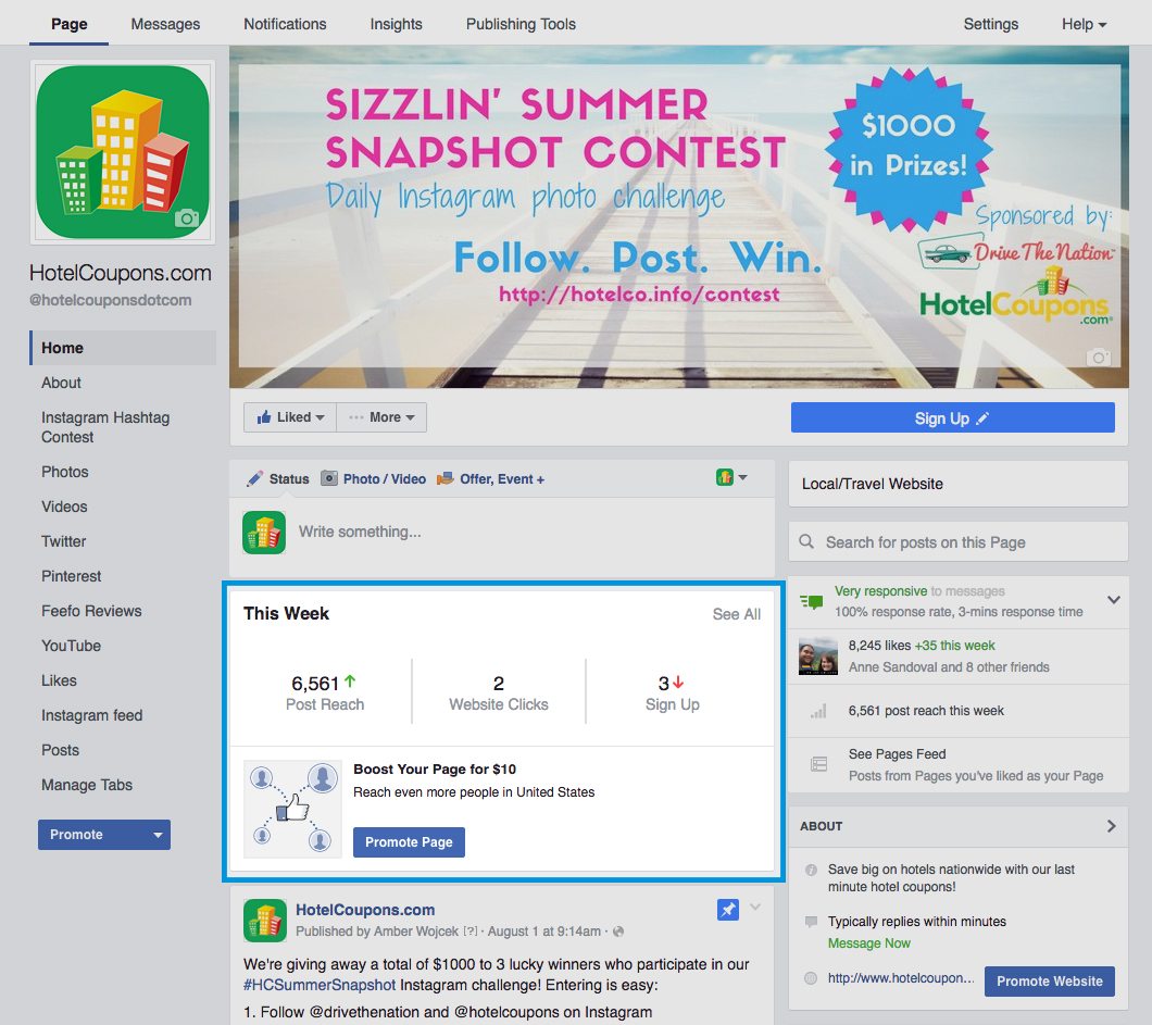
Now, all those pages and tabs are neatly added to a third column on the left. The cover photo is no longer covered up by your profile photo, text, and actions – instead, the Like and Message are much easier to find underneath the photo. Also, that small Book Now button is now an attention-grabbing blue button under your photo. Information about the business is now on the right side and posts are in the center of the page.
Admin View
If you’re logged in as the page admin, you’ll also see some helpful stats at a glance – your weekly post reach, website clicks, and actions taken on your page. The button to take said actions is also much larger and not hidden among the cover photo clutter like before (in the example below, “Sign Up” is our chosen action). By clicking the “see all” in the This Week box, you’ll be brought to the full Insights page.
While we’d like to be optimistic and say this is simply a nice change to help users navigate your page more easily, we can’t help but notice that in the single page view above there are three different “Promote” buttons throughout. It seems Facebook isn’t slowing down on heavily suggesting that to get seen, you have to put some money behind your Facebook business page.
What Should You Do?
As always, it’s a great idea to check out your Facebook page and make sure all the information is correct. With the responsive rate now easily visible, you want to be sure to be responding to messages as soon as you can. Download the Pages app by Facebook to receive notifications of messages to you page, and visit Settings > Messaging in Facebook to set up Instant Replies. This will boost your response rate and provide better service to your guests.
The other big change is, of course, your cover photo. There’s a good chance you don’t need to do anything here – the dimensions stayed almost the same. Before, Facebook cover photos were 851 px x 315 px and now come in about 830 px x 315 px. You likely didn’t have any important info on the left and right 10 pixels of your image, but it’s a good idea to check. Also, if you make a cover photo that is unbalanced from trying to avoid putting information where your profile photo used to go, you may want to rearrange your image.
We create custom Facebook cover photos for our social media customers to show off your property. Learn more about our Social Media products, including our social posting service, ongoing promotions, a booking app, and more.



0 Comments