The Evolution of a Hotel Website

For hoteliers, a website is the lifeblood of your marketing strategy. It is the most effective way of communicating about your hotel to a traveler, and the best source of information for someone making a booking decision. A visit to your website could be the first time a potential guest will interact with your property online, and it’s imperative to give a good first impression.
We explored the history of the hotel website over the years to identify how travelers navigate the internet and the way hoteliers have evolved to meet these needs. As an example, we’re going to walk through the RamadaSeaWorld.com website to illustrate how far we have come through the last two decades. We’ll show what has changed, what’s working now, and what you need to do to make your website as effective as possible to encourage direct bookings.
Example: Hotel Website in 2001
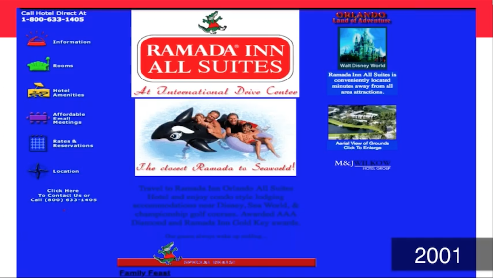
You may have forgotten that this colorful background was the norm in the early aughts. Today, this website would have some major ADA compliance issues for how difficult it is to read the black-on-blue content. Another element that sets this far apart from websites today is the lack of images. Travelers expect to see a variety of photos of your property and your room.
One thing they got right? The focus on conversions. Their phone number was listed in four different places just on the homepage alone. Before online booking engines, this was the best way to convert searchers into guests. Next, we’ll jump ahead a decade and see what has changed.
Example: Hotel Website in 2012
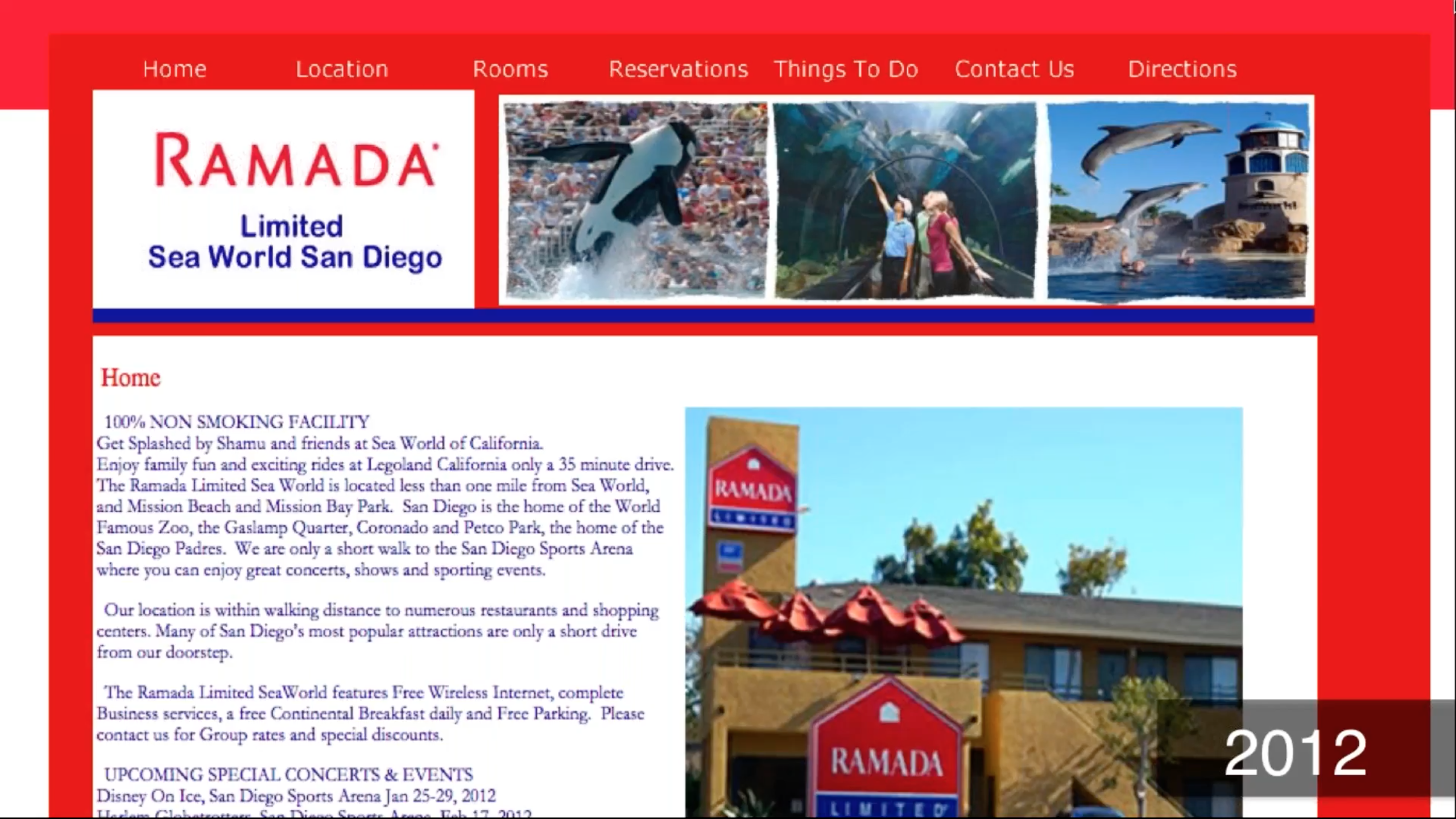
Flash forward to 2012. The iPhone 5 is just about to hit the market. Boasting a bigger screen than ever before (at a 16:9 aspect ratio) and with LTE connectivity for the first time, we were well on our way to embracing the idea of consuming more media on our devices. However, we’re still a few years before Google’s “mobilegeddon” algorithm update that would prioritize mobile-friendly sites. Desktop website views were still the norm, as you can see in this example.
Compared to the first, you see improvements in property photos, text legibility, and easier menu navigation. However, it’s still difficult to read, with all of the information in one large text block. We also see a “reservations” link allowing travelers book online. We’re moving in the right direction, but we’re far from being to the standards we hold today.
Example: Hotel Website in 2014
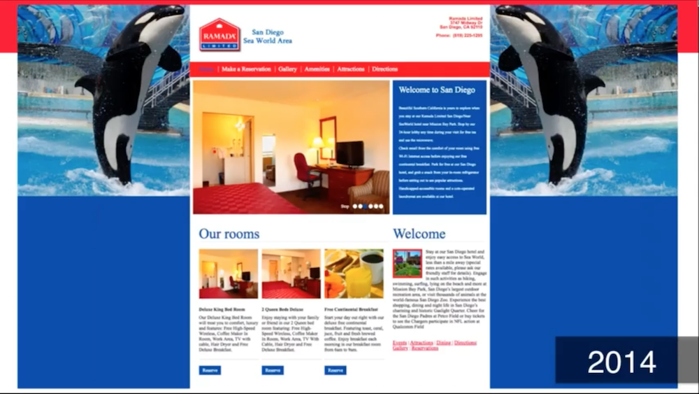
Just two years later, we see some great improvements to this hotel website. With a photo slideshow, room descriptions, and an easy navigation, this website makes it easy for visitors to find what they need. There are many places that make it easy to convert, from the “Reserve” buttons to the action-driven “Make a Reservation” link in the menu.
While we’re on the right track to giving guests the information they need, there’s still one vital component that’s missing: responsiveness. Soon, people will be turning to their phones to research travel and book reservations, and hotel websites need to keep up.
Example: Hotel Website in 2018
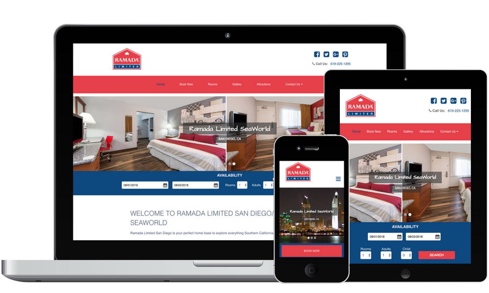
Today, this website is accessible to anyone, regardless of device. You’ll also notice that social media icons are integrated right at the top, and the booking calendar is right on the homepage. Further down the page, there is a video tour and the ability to provide guest feedback. All elements of the hotel’s digital needs are brought together into one place.
As the Internet changes, so do the expectations of the people using it. If your website has been stagnant for years, you’re not just staying in place – you’re falling behind. Every day, the hotel industry gets more competitive. More hotels are opening, OTAs are growing, and guests have more power than ever to choose the perfect hotel for them.
Is your hotel website keeping up? Learn more about our hotel websites or request a demo today of our budget-friendly hotel website solutions.
This content originally appeared in a webinar. Watch the full presentation below.



0 Comments